
Color Psychology: Best Colors for a Welcoming Rental Space
When designing a rental space, the choice of colours can have a profound impact on how guests feel the moment they step inside.
Colour psychology, the study of how colours influence human emotions and behaviours, plays a crucial role in interior design.
Whether you own a short-term vacation rental, an Airbnb, or a long-term rental property, selecting the right colours can enhance guest comfort, increase satisfaction, and even boost booking rates.
A welcoming rental space should feel warm, inviting, and comfortable. The right colour palette can create an atmosphere that makes guests feel at home, relaxed, and eager to return.
The Psychology of Colors in Interior Design
Colours have the power to evoke emotions, set moods, and influence decision-making. Interior designers and hospitality experts leverage color psychology to create aesthetically pleasing environments that align with the desired guest experience.
Warm vs. Cool Colors
Understanding the difference between warm and cool colours can help in designing an inviting rental space:
- Warm Colors (Red, Orange, Yellow): These colours create a sense of warmth, cosiness, and energy. They are great for social spaces like living rooms and dining areas.
- Cool Colors (Blue, Green, Purple): These colours evoke calmness, relaxation, and serenity, making them ideal for bedrooms and bathrooms.
- Neutral Colors (White, Beige, Gray, Brown): These colours serve as a balanced foundation, adding sophistication while allowing flexibility for accents and decor.
Best Colors for a Welcoming Rental Space
Now that we understand the basics of colour psychology, let’s explore the best colours to use in a rental property to create a welcoming atmosphere.
1. Soft Neutrals: The Safe & Versatile Choice
Examples: Beige, ivory, taupe, and light grey.
Why They Work: Soft neutrals create a clean, sophisticated, and universally appealing look. They are easy to decorate around and make spaces appear larger and more open.
- Beige and ivory add warmth without overwhelming the space.
- Light grey is a modern alternative that maintains neutrality while adding depth.
- Neutrals serve as a perfect backdrop for pops of colour in furniture and decor.
Best Areas for Use: Entire home, living rooms, and hallways.
Read This: The Power of Online Reviews for Short-Term Rental Success
2. Warm Earthy Tones: Cozy & Homely Feel
Examples: Terracotta, warm brown, muted mustard, and burnt orange.
Why They Work: Earthy tones create a cosy, grounded feel reminiscent of natural landscapes. These colours evoke warmth and hospitality, making guests feel comfortable and relaxed.
- Terracotta adds a rustic, inviting touch, perfect for creating a homey atmosphere.
- Warm browns and muted mustard shades enhance a sense of security and comfort.
Best Areas for Use: Bedrooms, dining areas, and accent walls.
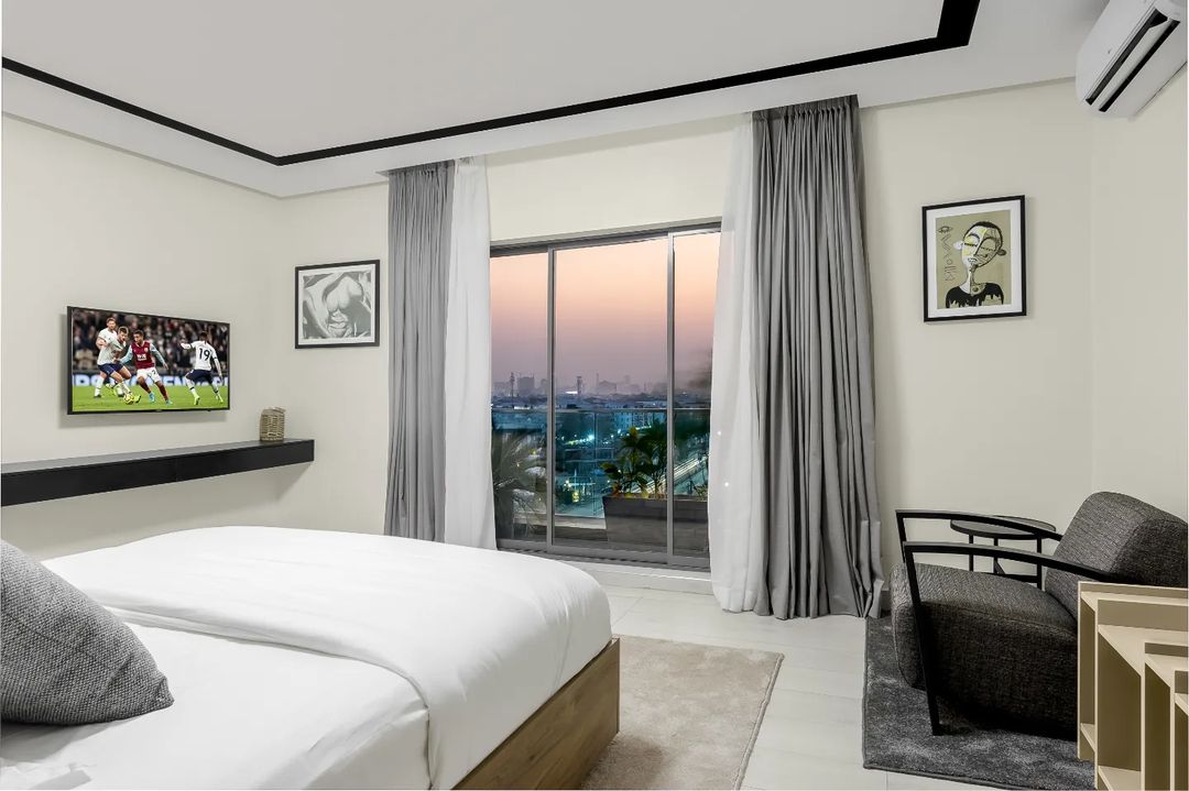
3. Calm & Tranquil Blues: A Serene Escape
Examples: Sky blue, navy, teal.
Why They Work: Blue tones are associated with relaxation, trust, and calmness. They create a peaceful environment, making them perfect for spaces designed for rest.
- Lighter blues, like sky blue, open up small spaces and create an airy feel.
- Deeper blues, like navy, add elegance and sophistication without feeling overwhelming.
- Teal is a great blend of blue and green, offering both tranquillity and a touch of vibrancy.
Best Areas for Use: Bedrooms, bathrooms, and study areas.
See This: How to Furnish Your Short-Term Rental on a Budget
4. Refreshing Greens: Nature-Inspired Comfort
Examples: Sage green, olive, soft mint.
Why They Work: Green represents nature, balance, and rejuvenation. It brings a sense of freshness to a space, making guests feel relaxed and connected to the environment.
- Sage green has a subtle, soothing effect that complements various decor styles.
- Olive green adds warmth and sophistication while maintaining a natural feel.
- Soft mint is refreshing and works well in bright, airy spaces.
Best Areas for Use: Living rooms, bathrooms, and outdoor spaces.
5. Cheerful Yellows: A Burst of Optimism
Examples: Soft buttery yellow, pastel yellow, golden hues.
Why They Work: Yellow is associated with happiness, energy, and warmth. A well-chosen shade can brighten up a rental space, making it feel lively and inviting.
- Soft yellows work well in spaces where natural light is limited.
- Pastel yellows create a gentle, uplifting ambience.
- Golden hues add a sophisticated yet cosy feel.
Best Areas for Use: Kitchens, breakfast nooks, and entryways.
6. Elegant & Welcoming Warm Whites
Examples: Off-white, creamy white, antique white.
Why They Work: White is a classic choice for making spaces feel fresh, open, and welcoming. However, pure white can feel stark and cold, which is why warm white shades are preferable.
- Off-white creates a soft, cosy environment without feeling too bright.
- Creamy whites add warmth and elegance to the space.
- Antique white works well with vintage or rustic decor styles.
Best Areas for Use: Entire homes, especially small spaces that need to feel larger.
See This: How Often Should You Deep Clean a Short-Term Rental?
Colors to Avoid in Rental Spaces
While bold colours can make a statement, some hues may not be ideal for a rental space. Here are a few colours to use cautiously:
- Overly Dark Colors (Black, Deep Red, Dark Brown): These can make a space feel smaller and less inviting.
- Neon Shades (Bright Pink, Electric Blue, Lime Green): These colours can feel overwhelming and might not appeal to most guests.
- Very Intense Reds: While red can be exciting, too much can create a sense of agitation and restlessness.
Tips for Using Color in Rental Spaces
- Balance bold colours with neutrals. If you love bold colours, consider using them as accent walls rather than painting an entire room.
- Use decor and furnishings to introduce pops of colour. This allows for flexibility and easy updates.
- Consider lighting. Natural and artificial lighting can affect how a colour appears.
- Test colours before committing. Paint a small area and observe how it looks in different lighting conditions throughout the day.
Read This: How to Make a Small Short-Term Rental Look Spacious
Conclusion
Choosing the right colours for a rental space can significantly impact guest experience, mood, and satisfaction.
By understanding colour psychology, you can create a welcoming, comfortable, and visually appealing environment that encourages positive reviews and repeat bookings.
Whether you opt for soft neutrals, earthy tones, serene blues, refreshing greens, cheerful yellows, or warm whites, the key is to create a balanced and inviting atmosphere.
Keep your target audience in mind, consider the natural lighting, and make thoughtful colour choices that enhance the overall experience of your guests.
Now, it’s time to refresh your rental space with colours that create the perfect welcoming ambience.